BARBARA KRUGER

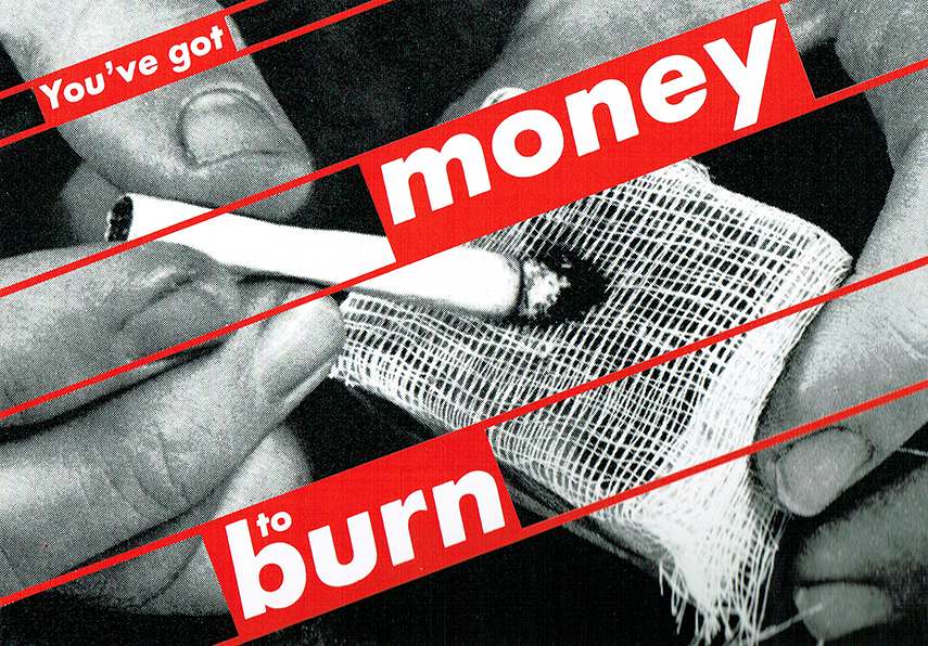
Barbara Kruger, You've got money to burn, 1987

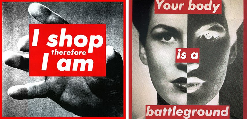
Barbara Kruger, I shop therefore I am, Barbara Kruger, Your body is a battleground, 1989
1987
Born right in Newark NJ, Barbara Kruger had a pretty typical and comfortable upbringing. Her mother worked as a legal secretary and her father worked as a chemical technician. She went to Syracuse University but left a year later due to the passing of her father. Kruger soon realizes her passion for art and graphic design and began a semester at Parson's School of Design in New York. Kruger, from there, works in freelancing art, graphic design magazine gigs, creating book-jacket covers and soon involving some poetry in her works. Barbara developed a great interest in poetry and began to attend many poetry readings and writings. From then on, her love for design and sending a message about the current uprising political issues soared through many publications. What makes Barbara's work so striking is that she makes the viewer really think. Her word choices and phrasing digs inside the readers head and allows the reader to think about the message in the context of the picture.
Many of Kruger's designs contain messages, even Kruger has mentioned that "I work with pictures and words because they have the ability to determine who we are and who we aren't." (Wayback Magazine 2010). Her ability to use text and photo/film to manipulate people thoughts to think about the bigger political messages. One of the pictures above says, "Your body is a battleground". This piece of art was originally designed for a pro-choice rally during the equal rights movement in Washington 1989. The image of the woman with two sides to her face gives many an opinion to what they think could be Kruger's message. Her works were more advertisements for strength. It uplifts women by comparing a woman's body to a battleground because of the constant debate over the issue on what women should do to their bodies during childbirth. The use of red as the only color in Kruger's designs draws an urgency to her already controversial work. The red creates the urgent and dangerous power dynamic and most likely was chosen to make viewers feel the cautious message of social stereotypes and political opinion since red is used for situations of intensity that is used to get people to pay attention to something. Such as red lights telling people to stop immediately and red alerts which are used in situations of danger. Kruger's images cause viewers to analyze and stop to think that this constant struggle for control over women's bodies. Kruger's art is meant to empower women and cause the public to think using images and cliche phrases to critique a certain element in sexism and other controversial issues.
More info on Kruger's message, artwork, and exhibitions:
http://www.barbarakruger.com/
No comments:
Post a Comment